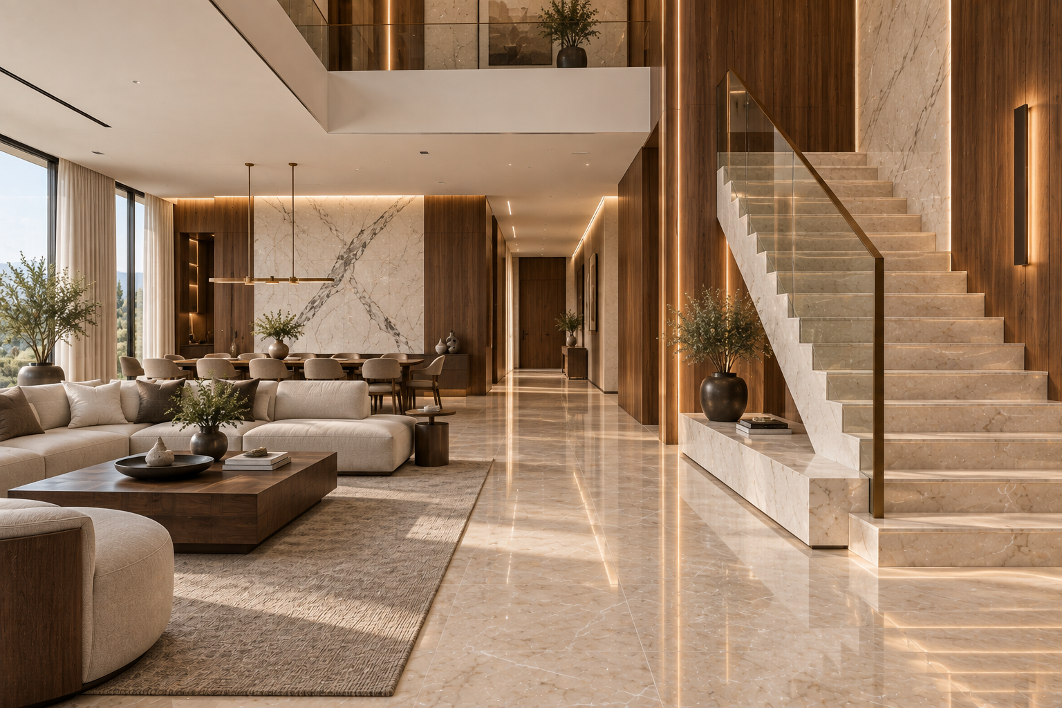
The idea to remember: Let the marble and one other material lead. Choose the rest of the palette to support them through compatible undertones, contrast, texture and visual strength—not by trying to match every colour exactly.
A marble slab may look exceptional in isolation, but interiors are not built from marble alone. Timber, metal, glass, upholstery, rugs, wall finishes and lighting all change how the stone feels. Warm beige marble beside walnut can feel rich and calm; the same stone beside cool grey lacquer and cool lighting may look flatter. Dramatic Statuario can feel refined beside simple timber and linen, yet busy beside patterned furniture, shiny brass and decorative walls.
When choosing marble, do not ask only, “Do I like this slab?” Also ask, “What will this slab sit next to?” The actual slab and the complete room palette matter more than the marble name alone.
A quick starting point
Pairing marble with the rest of the room.
| Marble character | Wood | Metal | Fabric | Overall effect |
|---|---|---|---|---|
| Warm beige | Walnut | Bronze / brass | Cream / taupe | Warm luxury |
| White with dramatic veins | Walnut / dark oak | Black / bronze | Plain ivory | Strong contrast |
| Fine-veined white | Pale oak | Nickel / bronze | Soft grey / cream | Calm contemporary |
| Bright white | Warm oak | Bronze / black | Beige / textured | Bright but balanced |
| Warm expressive marble | Dark wood | Bronze | Light neutral | Rich and architectural |
These are design directions rather than fixed prescriptions. Start with the marble’s natural character, then decide which material should lead and which should recede.
01 — Start with undertone, not just colour.
Two beige marbles can look completely different beside the same wood. One may lean creamy, yellow, taupe, grey or brown. White marble can also read cool, neutral or slightly warm. Those subtle undertones become more visible once the stone is next to cabinetry, flooring, fabric and paint.
Pair from the actual slab rather than relying on its commercial name or a small sample. Put the real wood, fabric and wall references beside it, and assess the group in light close to the room’s final conditions.
COOLER WHITE MARBLE → GREY OAK · NICKEL · CHARCOAL · SOFT WHITE
BALANCED WHITE MARBLE → CAN MOVE WARM OR COOL DEPENDING ON ITS SURROUNDINGS
02 — Marble and walnut.
Walnut is one of the most dependable premium pairings because its depth and visible grain soften stone and add warmth. It works particularly well with Botticino, Brescia Aurora, Venatino and Statuario, although the final effect depends on each slab’s tone and movement.
- Botticino + walnut: warm, cohesive and comfortable for broad living spaces.
- Statuario + walnut: the timber reduces the coolness of white marble and makes the contrast feel intentional.
- Venatino + walnut: elegant contrast without overwhelming its finer movement.
Keep brass or bronze selective and use plain cream upholstery when the stone already has strong veins. Walnut has enough visual character to act as a meaningful partner without needing extra pattern everywhere.
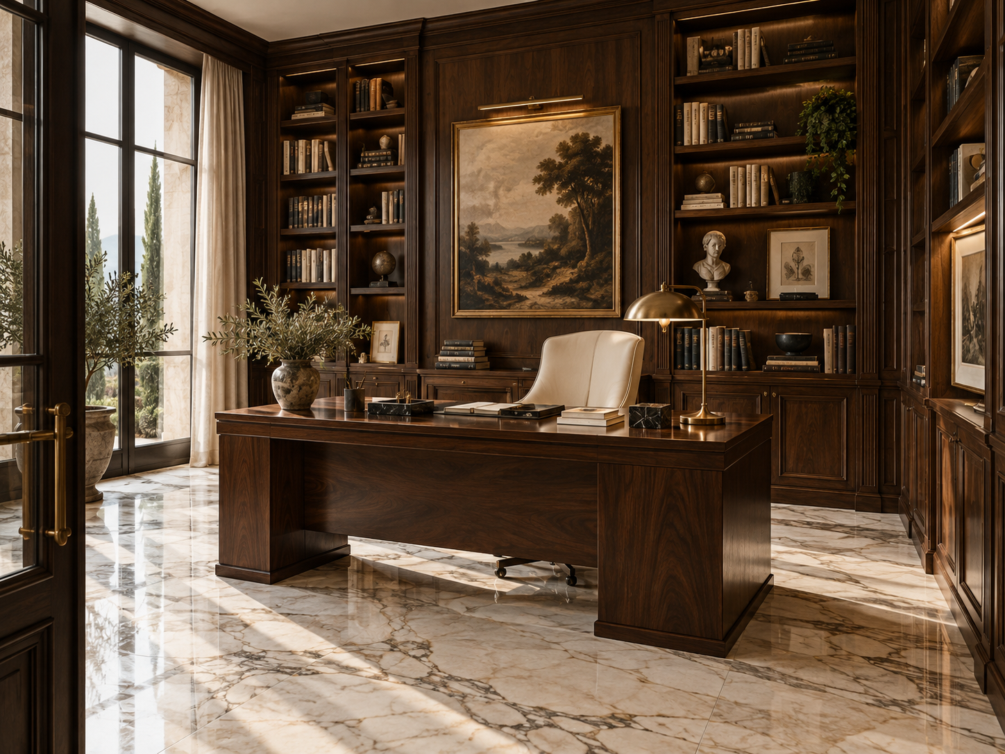
03 — Marble and light oak.
Light oak suits contemporary interiors that should feel bright, soft, natural and understated. It supports a pale marble without the strong contrast of walnut, while the wood grain gives a room with polished stone some warmth and texture.
- Venatino + light oak: calm and refined.
- Vietnam White + light oak: bright without feeling sterile.
- Botticino + light oak: warm, but visually lighter than a walnut combination.
Check the oak’s undertone against the marble. A pink, yellow or grey cast in the timber can alter the apparent warmth of the stone; compare actual veneer or finish samples instead of matching from a screen.
04 — When dark wood works better.
Dark timber can make a light marble feel brighter and more architectural. Explore Statuario with dark walnut, Venatino with smoked oak, or Vietnam White with a darker timber when you want stronger definition.
Watch the overall visual weight. Brescia Aurora, very dark wood and low lighting may feel dense unless lighter wall, fabric or glass surfaces balance the room.
| Marble | Light oak | Walnut | Dark / smoked wood |
|---|---|---|---|
| Botticino | Excellent | Excellent | Good |
| Statuario | Good | Excellent | Excellent |
| Venatino | Excellent | Excellent | Good |
| Vietnam White | Excellent | Good | Excellent |
| Brescia Aurora | Good | Excellent | Use carefully |
| Marmi Crema | Excellent | Excellent | Good |
This matrix is a starting point, not a rule: the exact slab, timber finish, room proportions and lighting can change the pairing.
05 — Marble and brass.
Brass adds warmth and visual richness, especially beside warm marble. It is usually most effective as an accent rather than a dominant field: consider lighting, furniture legs, cabinet handles, railing details, mirror frames and carefully placed trims.
- Botticino + brass: classic warm luxury.
- Brescia Aurora + brass: rich and expressive.
- Statuario + brass: white-grey contrast softened by a warm metal.
If the marble has strong movement, keep the brass details restrained so that the stone remains legible and the overall hierarchy stays clear.
06 — Brass can become too much.
A room can lose its hierarchy when heavily veined marble is combined with polished brass, mirrored glass, decorative chandeliers, glossy furniture and patterned fabrics. Each material asks for attention, so the eye has nowhere to rest.
Give statement marble space: pair it with small brass accents, quieter wood and plain fabric. If a chandelier or brass detail is already prominent, let the marble or furniture be calmer.
07 — Bronze versus brass.
These metals are related, but their brightness and visual weight differ. The right option depends on whether the room should feel more decorative or more restrained.
| Metal | Typical character | Often useful when |
|---|---|---|
| Brass | Brighter, warmer and more decorative | The palette needs a warm highlight or a classical note. |
| Bronze | Darker, quieter and more architectural | The design calls for understated contrast and controlled accents. |
There is no universal winner. Compare the metal finish in the room’s actual light, and consider how often it repeats across handles, lights, frames and fittings.
08 — Marble and black metal.
Black gives clean definition and can work especially well with Statuario, Venatino and Vietnam White. Use it for slender window frames, railings, lighting, furniture structures or a few architectural lines.
When the marble already contains strong dark veins, avoid turning every room edge into another black line. A little black can sharpen the composition; too much may fragment it.
09 — Marble and glass.
Glass is useful because it introduces transparency rather than another strong pattern. It can keep a marble surface visually dominant while adding lightness to a room with substantial stone, wood or metal.
Consider glass for staircase balustrades, shower enclosures, cabinet fronts, dining tables or room partitions. Alongside dramatic marble, clear glass is often an easier partner than another heavily textured material.
GLASS = TRANSPARENCY + LIGHTNESS
TOGETHER = VISUAL BALANCE
10 — Clear versus smoked glass.
Choose glass by the amount of contrast and visibility the room needs. Clear glass keeps the stone bright and easy to see; smoked glass adds depth and a more defined, sophisticated note.
| Glass type | Effect | Pairing considerations |
|---|---|---|
| Clear | Bright, transparent and visually light | Useful when the marble should remain visible and the room needs openness. |
| Smoked | More contrast and visual depth | Can suit Statuario, Venatino, Vietnam White or Botticino with dark timber. |
Smoked glass with dark marble, dark wood and low light can make a palette too heavy. Add a lighter wall, fabric or floor area, or choose clear glass to restore balance.
11 — Marble and fabric.
Fabric is what stops a stone-heavy room from feeling hard. Linen, bouclé, wool, textured upholstery, soft curtains and rugs absorb sound and visual intensity. Their softness is especially important when polished marble covers a large floor.
| Marble | Fabric direction to consider |
|---|---|
| Botticino | Cream, taupe or warm grey |
| Statuario | Ivory, oatmeal, with selective charcoal accents |
| Venatino | Soft grey, cream or beige |
| Vietnam White | Beige, camel or textured cream |
| Brescia Aurora | Ivory, sand or light taupe |
12 — Why texture matters.
When every surface is smooth—polished marble, glossy cabinetry, glass, metal and lacquer—the room can feel visually hard. Add tactile contrast through timber grain, linen, plaster, rugs, matte paint and upholstery. Texture helps polished stone feel more refined rather than simply more shiny.
Example: Statuario + walnut + linen + bronze. The marble gives movement, walnut adds grain, linen softens the room and bronze supplies a small warm accent.
13 — Botticino material palette.
A useful Botticino direction is warm, elegant and understated. The stone provides a beige foundation; walnut or warm oak adds natural depth; bronze or antique brass introduces a modest highlight; cream or taupe fabric and warm off-white walls complete the composition.
Keep the total palette warm, but introduce enough difference in depth and texture that the room does not become one flat beige field.
14 — Statuario / Satvario material palette.
Statuario’s expressive white-and-grey movement can lead the room. Walnut provides warmth, while bronze or black metal defines selected details. Plain ivory fabric keeps the stone legible, and clear glass preserves a sense of lightness.
The goal is strong stone contrast without unnecessary decoration. Keep supporting patterns quiet where the marble is most visible.
15 — Venatino material palette.
For a quieter contemporary mood, combine Venatino with light oak, soft grey or off-white fabric and a discreet brushed nickel or bronze finish. This palette lets fine veining remain visible without making every element a focal point.
16 — Vietnam White material palette.
Vietnam White can create a bright room that still feels welcoming when it is paired with warm oak, bronze or black details and beige linen. The warmer wood and fabric keep the white stone from reading as clinical.
17 — Brescia Aurora material palette.
Brescia Aurora has a warmer, more expressive character. Walnut, dark bronze, light cream upholstery and warm-neutral walls can create a rich architectural palette. Keep the fabric and broad wall areas lighter so the combined marble and timber do not become visually dense.
| Marble | Wood | Metal | Fabric | Best mood |
|---|---|---|---|---|
| Botticino | Walnut | Bronze | Cream | Warm luxury |
| Statuario | Walnut | Black / bronze | Ivory | Dramatic contemporary |
| Venatino | Light oak | Nickel / bronze | Soft grey | Calm minimal |
| Vietnam White | Warm oak | Black / bronze | Beige | Bright modern |
| Brescia Aurora | Walnut | Dark bronze | Ivory | Rich warm |
18 — Do not match everything exactly.
Trying to make the beige marble, sofa, wall, rug, curtains and timber all the same colour can make a room feel flat. Aim for a relationship rather than a perfect colour match: keep the palette within a compatible warm or cool family, then use differences in depth and texture to give it definition.
+ DEEP WALNUT
+ LIGHT CREAM FABRIC
+ DARK BRONZE
ONE RELATED PALETTE · FOUR DISTINCT MATERIAL ROLES
19 — Choose between three levels of contrast.
Deciding on the intended mood first can make individual material decisions easier. These combinations illustrate low, medium and high contrast rather than prescribing a fixed scheme.
Consider how the contrast will read across full surfaces, not only in a hand-sized sample board. A dark wood wall or repeated black frames occupy much more visual area than a small swatch suggests.
20 — Match vein strength with the furniture.
If the marble is heavily patterned, furniture and upholstery should usually become simpler. Use plain fabric, a quieter wood grain and restrained metal so the stone can lead. If the marble is quiet, there is more room for textured furniture, patterned fabric or stronger objects.
| Marble character | Supporting materials |
|---|---|
| Loud or strongly veined | Quiet fabric, simple wood grain, restrained metal and fewer patterns |
| Quiet or fine-veined | More freedom for textured furniture, stronger objects or patterned fabric |
IF MARBLE = LOUD, OTHER MATERIALS = QUIET.
IF MARBLE = QUIET, SUPPORTING MATERIALS CAN BE STRONGER.
21 — Consider the whole room, not a sample board.
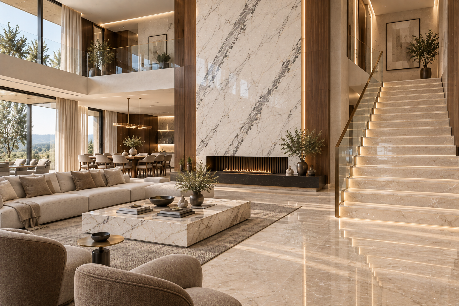
Material boards are useful for comparing colour and texture, but a small marble sample beside a small wood sample cannot show how those materials behave at room scale. Consider the visual area: marble covering a large floor, walnut across a wall, or brass repeated through many fittings will have more influence than a small swatch suggests.
The illustration below is only a way to think about visual dominance—not a strict formula. One living room might use the largest share for walls and paint, with marble as an anchor, wood as a secondary field, fabric adding softness and metal appearing sparingly.
22 — Lighting can change the combination.
A material palette viewed in a showroom may look different at home. Warm light can make Botticino warmer, brass richer, walnut deeper and white marble creamier. Cool light can strengthen grey veins, cool the appearance of metal and make white marble feel more clinical.
| Lighting direction | Possible effect on the palette |
|---|---|
| Warm | Beige marble and walnut feel warmer; brass appears richer. |
| Cool | Grey veins and cooler metals may appear stronger; white stone can feel more clinical. |
| Daylight | Changes with orientation and time; useful for observing the stone’s natural character. |
Review the materials together under lighting close to the final environment whenever possible. If that is not available, compare them under more than one light source before making a final palette decision.
23 — Common material-pairing mistakes.
- Too many strong materials: every surface competes for attention.
- Matching colours too closely: the room loses depth and can feel flat.
- Ignoring undertones: warm and cool materials may clash when placed together.
- Using brass everywhere: a special accent becomes a dominant finish.
- Pairing strong marble with patterned fabric: competing movement can make the room busy.
- Forgetting texture: an otherwise smooth, stone-heavy space can feel hard.
- Choosing from separate showrooms: marble, timber and fabric are never compared as a group.
- Ignoring lighting: the finished combination may shift from the selection impression.
24 — A simple four-step pairing method.
- Choose the marble. Start with the actual slab and the role it should play.
- Identify its undertone. Decide whether it reads warm, cool or neutral in the room’s light.
- Choose one wood direction. Compare light, medium and dark options beside the stone.
- Add supporting metal and fabric. Use a finish and textile that complete the hierarchy without competing.
Do not start by trying to decide six materials simultaneously. Establish a lead stone and one wood first; then build the supporting palette around them.
25 — The Fratelli Singh material-pairing approach.
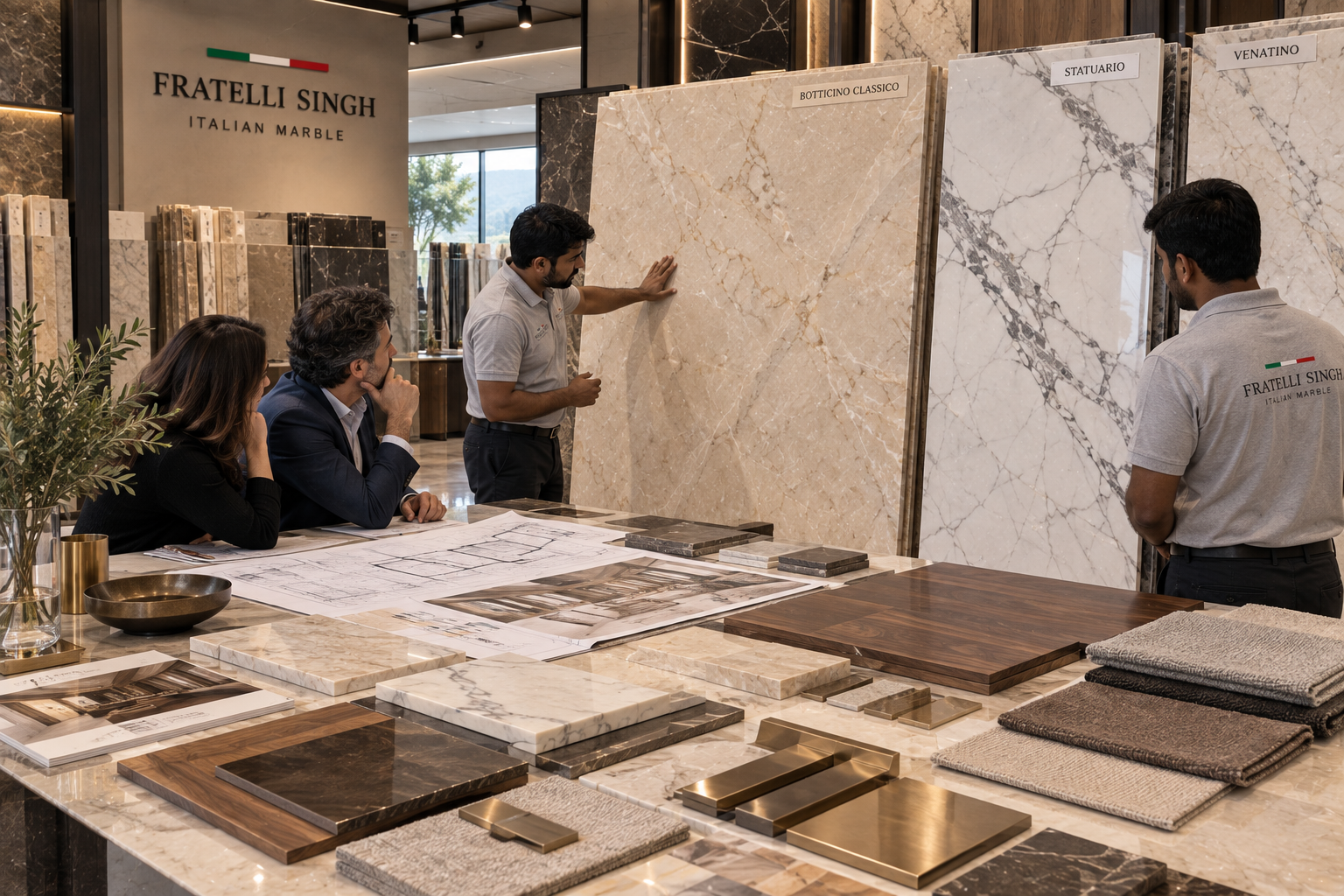
When selecting marble for an interior, bring or share the real materials and references that will surround it:
- A wood or veneer sample
- A fabric sample
- The wall colour
- The intended metal finish
- A project render or floor plan
Compare those references against the actual full marble slab. This is more reliable than choosing the stone first and trying to force every other finish around it later.
Before you finalise
Material pairing checklist.
The rule to remember
Match materials by relationship, not colour alone.
Consider undertone, contrast, texture and visual strength. That is what makes several beautiful materials feel like one interior rather than unrelated purchases.
Clear answers
Frequently asked questions.
Which wood looks best with Italian marble?
There is no single best wood. Walnut works especially well with both warm beige and white marbles, while light oak works particularly well with restrained white or cream stones. Compare wood against the actual slab and room lighting.
Does Botticino look good with walnut?
Yes. Both have naturally warm characteristics, making Botticino and walnut a strong combination for warm luxury interiors.
What wood works with Statuario marble?
Walnut, dark oak and lighter natural oak can all work. Darker timber provides stronger contrast, while lighter timber creates a softer contemporary look.
Does marble work with brass?
Yes. Brass can add warmth and richness, but it is usually most effective when used selectively as an accent.
Brass or bronze—which is better with marble?
Brass is brighter and more decorative, while bronze is usually darker and more understated. The better option depends on the desired interior style.
Does glass work with marble?
Yes. Glass introduces transparency without adding another strong pattern, making it especially useful alongside expressive marble.
What fabrics work with white marble?
Cream, beige, oatmeal, soft grey and other textured neutrals can soften white marble and prevent the interior from feeling overly cold.
How do you make marble interiors feel warmer?
Introduce natural wood, textured fabrics, warm-neutral walls and appropriately warm lighting rather than relying only on stone and glossy finishes.
Can marble and dark wood be used together?
Yes. Dark wood can provide excellent contrast with white or light marble. With darker warm marble, enough light surfaces should remain to prevent the room from becoming too heavy.
Can Botticino and brass be used together?
Yes. Their warm undertones can complement each other particularly well.
Should furniture be selected before marble?
Neither necessarily needs to be completely final first, but the major materials should be coordinated together rather than selected independently.
Should I take wood and fabric samples when selecting marble?
Yes. Comparing real materials directly against the full slab can reveal undertone and contrast differences that photographs or digital renders may not show accurately.
Building a material palette?
Bring your wood, fabric, wall and metal references to a slab review. Comparing them against the actual full marble slab helps turn individual selections into a coherent interior.
Request assistance ↗