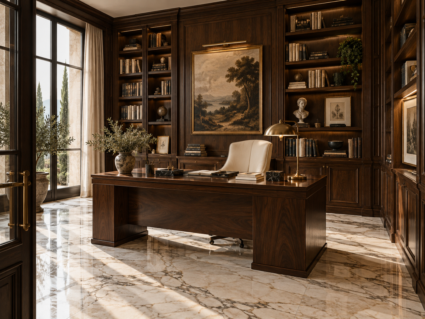
The short answer
Choose the marble for the relationship you want with the wood.
Dark timber already brings depth, warmth, visible grain and visual weight. Beside walnut, smoked oak or dark veneer, marble should be selected as part of the same palette. A light stone can sharpen contrast and lift the room; a warm beige stone can continue the timber’s warmth; a heavily patterned stone can add richness, but it may also make an already weighty room feel crowded.
| Desired effect | Marble direction | What it contributes |
|---|---|---|
| Strong contrast | Statuario / Satvario | Bright white field and expressive grey movement |
| Refined light contrast | Venatino | Quieter white with fine, controlled veining |
| Maximum brightness | Vietnam White | A lighter, simpler stone backdrop |
| Warm luxury | Botticino | Beige and cream tones that relate to walnut |
| Rich layered interior | Brescia Aurora | More expressive beige, taupe and brown movement |
| Soft tonal palette | Marmi Crema | A quieter, creamy transition |
The first decision is whether you want contrast or harmony. Both can feel luxurious; they simply make different rooms.
Dark wood + light marble
Statuario · Venatino · Vietnam White
Sharper · brighter · more contemporary
Dark wood + warm marble
Botticino · Brescia Aurora · Marmi Crema
Softer · richer · warmer
01 · Start with the timber
First identify the wood, not just its name.
“Dark wood” can mean several different colours and finishes. Warm walnut is not the same as grey-brown smoked oak; a reddish stain behaves differently from a near-black wenge-like finish. Even two walnut veneers can vary in warmth, grain scale and darkness. These details affect whether a marble feels coordinated, too yellow, too cool or sharply contrasted.
Use the actual timber, veneer or cabinet-door sample whenever possible. If you only have a reference image, note the light under which it was photographed: a warm filter can make a neutral wood look redder, while cool daylight can make it look greyer.
| Wood character | Marble directions to compare | Selection note |
|---|---|---|
| Warm walnut | Botticino, Statuario, Venatino | Choose warm continuity or deliberate white contrast |
| Brown-black timber | Light warm stone or white marble | Brightness can stop the palette closing in |
| Grey smoked oak | Venatino or Statuario | Check that grey undertones feel intentional |
| Rich reddish-brown timber | Cream or balanced white stone | Avoid layering too many red or golden notes |
| Very dark charcoal wood | Brighter marble often helps | Use warm textiles if the overall effect feels cold |
02 · High contrast
Statuario and dark walnut create a strong architectural pairing.
Statuario / Satvario brings a white background and visible grey movement; walnut brings deep warmth, grain and mass. Their contrast is clear from across a room, which makes the pairing effective where the design needs a focal point rather than a barely noticeable transition.
Consider it for a feature wall, formal dining room, bar, statement table or island, bathroom vanity wall, or entrance feature. In broad flooring areas, look at the complete slab and the way the veining repeats across multiple pieces before committing to a highly expressive selection.
Strong marble movement + strong wood grain
↓
Keep fabric, metal, wall finish, rugs and lighting forms quieter.
The pairing is strongest when one of the two materials leads. If the marble is the hero, choose calmer walnut panels and uncomplicated upholstery. If the walnut wall is the hero, use Statuario selectively rather than repeating it on every major surface.
03 · A softer contrast
Venatino keeps dark wood bright without demanding attention.
Venatino offers a lighter background and finer, more restrained veins than a dramatic high-contrast statement slab. Against dark walnut or smoked oak, it can brighten the room while allowing the timber to remain the dominant feature. The result often feels refined rather than formal.
This direction works especially well in bedrooms, modern offices, quieter living rooms, bathrooms and long flooring zones where a very dramatic stone pattern could become tiring. Review the vein scale across the whole slab: “quiet” is a relative quality, and natural variation still matters.
04 · Maximum brightness
Choose Vietnam White when very dark timber needs a lift.
Where the wood is close to black or covers a substantial wall or cabinetry run, Vietnam White can introduce a broad, bright counterpoint. Its simpler light field can make compact rooms, bathrooms, narrow foyers and dark kitchens feel less enclosed.
Brightness alone is not the whole palette. Under cold lighting, white stone beside charcoal timber can feel stark. Warm-neutral lighting, ivory fabric, a textured rug or a little warm metal can soften the transition without making the stone look yellow. Always check the slab and wood together in the project’s actual light.
05 · Warm luxury
Botticino and walnut make a softer, tonal pairing.
Botticino’s beige and cream character shares warmth with walnut but remains lighter in value. Rather than a crisp black-and-white contrast, this combination creates a layered, residential mood that can feel enduring and welcoming. It is a dependable direction for living rooms, dining rooms, bedrooms, foyers and selected bathrooms.
Build the palette from a few complementary materials, then stop before every finish becomes warm brown. Cream upholstery softens it; dark bronze can add a precise accent. Pale plaster, ivory, linen and clear glass create breathing room around the timber and stone.
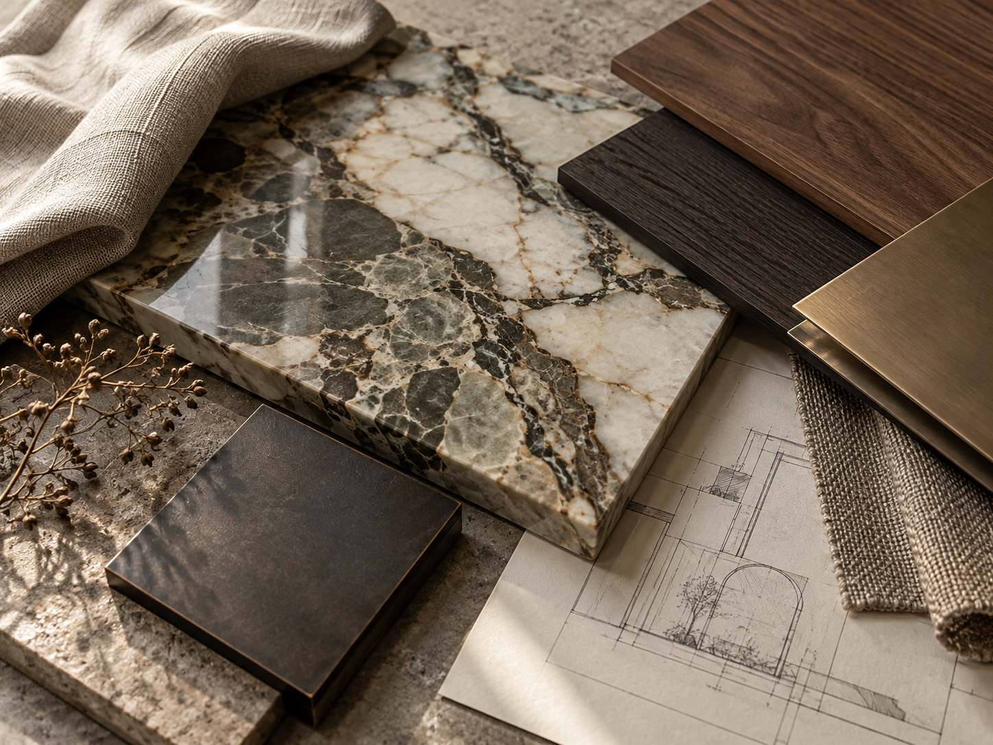
06 · Preserve tonal separation
When Botticino and dark wood become too heavy.
Botticino and walnut are not inherently too dark together. The risk comes from stacking several warm, deep surfaces at once: beige walls, brown curtains, a dark rug, leather seating, yellow lighting and brass everywhere. The eye has nowhere to rest, and the room can turn into one continuous brown-gold field.
Keep contrast in the supporting layers. Try ivory or warm-white walls, linen or oatmeal upholstery, pale plaster, a lighter rug, clear glass or a small area of dark bronze. The intent is not to cool down the palette completely; it is to let the warm marble and wood remain distinct from one another.
Warm stone and timber as the main character.
Walls, fabric and open surfaces around them.
Extra brown, gold and dark accents that repeat the same note.
07 · Rich layered interiors
Brescia Aurora with walnut is expressive and substantial.
Brescia Aurora can bring beige, taupe, brown movement and a stronger pattern; walnut adds its own grain and depth. Together they can feel exceptional in larger living spaces and hospitality interiors, where there is sufficient daylight and distance to read both materials.
Because both surfaces have presence, let supporting finishes breathe. Use lighter walls, cream fabric, restrained metal, and avoid repeating similarly busy patterns across rugs, artwork and upholstery. In smaller spaces, limit how much of the more expressive stone and dark timber appear in the same sightline.
↓
LIGHT WALLS · CREAM FABRIC · RESTRAINED METAL · GOOD DAYLIGHT
08 · Contemporary direction
Which marble and dark-wood combination looks most modern?
For a sharper contemporary room, Statuario with dark walnut gives a graphic, high-contrast effect. Venatino with smoked oak feels quieter and more restrained. Vietnam White with blackened timber is the most minimal and linear of these options. Modernity also comes from proportion and detailing: clean joints, controlled repetition, simple hardware and edited decoration.
White marble is not a requirement for a modern interior. Botticino with walnut can also feel contemporary when the stone is used in generous, simple planes and the surrounding detailing is uncluttered.
09 · Warm luxury
Which combinations feel warmest?
Botticino with walnut is the most balanced warm direction: beige stone and brown timber relate without becoming identical. Marmi Crema with walnut is softer and quieter. Brescia Aurora with walnut is the richest and most expressive. All three benefit from a light neutral surface so the warmth feels layered rather than monotonous.
Warm does not need to mean yellow. Check the stone and wood under neutral daylight as well as evening lamps, and use lighting that supports the undertones rather than exaggerating them.
10 · Balance the broad surfaces
With dark wood walls, let the marble floor balance the room.
Villas often combine walnut veneer, slatted panels, cabinetry and doors on the walls. When a large amount of dark wood already occupies the vertical surfaces, a quieter marble floor can make the room feel more open. Botticino, Venatino or Vietnam White can each do this in a different way: warm, refined or bright.
If the wood is limited to a single door, console or joinery element, the floor can carry more movement. Think about the total visible quantity in the main sightline—not merely the name of the wood or marble.
SMALL AMOUNT OF DARK WOOD → MARBLE CAN BE STRONGER
11 · Avoid competing focal points
Pair a dark-wood TV wall with a calmer marble floor.
A large walnut TV wall is already a focal plane. Botticino, Venatino, Vietnam White or another restrained stone can balance it without introducing a second dominant pattern underfoot. Avoid automatically placing another strongly veined marble behind the television as well.
In a single view, wood grain, floor veins, wall veins, display objects and the screen can all compete. Choose the surface that should lead, then reduce movement or contrast in the others. A strong marble can still work; it simply needs a clear role and space around it.
12 · Kitchen focal point
Use a marble island to break up a dark-wood kitchen.
A lighter island can interrupt a dark cabinetry block, add reflected light and create a central gathering point. The best pairing depends on cabinet undertone and the intended mood: Statuario for a strong focal contrast, Venatino for a quieter contemporary island, Vietnam White for maximum brightness, or Botticino when warmth should continue across the kitchen.
| Cabinetry | Marble island direction | Overall effect |
|---|---|---|
| Warm walnut | Statuario or Botticino | Strong contrast or warm continuity |
| Smoked oak | Venatino or Statuario | Refined grey-white contrast |
| Very dark brown | Vietnam White or Venatino | Brighter and less enclosed |
| Dark grey wood | White-grey marble | Cool, architectural palette |
| Rich warm timber | Botticino or restrained white marble | Warmth with a light counterpoint |
Pay special attention to the island edge, overhang and visible end panels: they expose the stone’s thickness and movement at eye level. Lay out the slab before cutting so the most attractive, balanced areas land on the prominent faces.
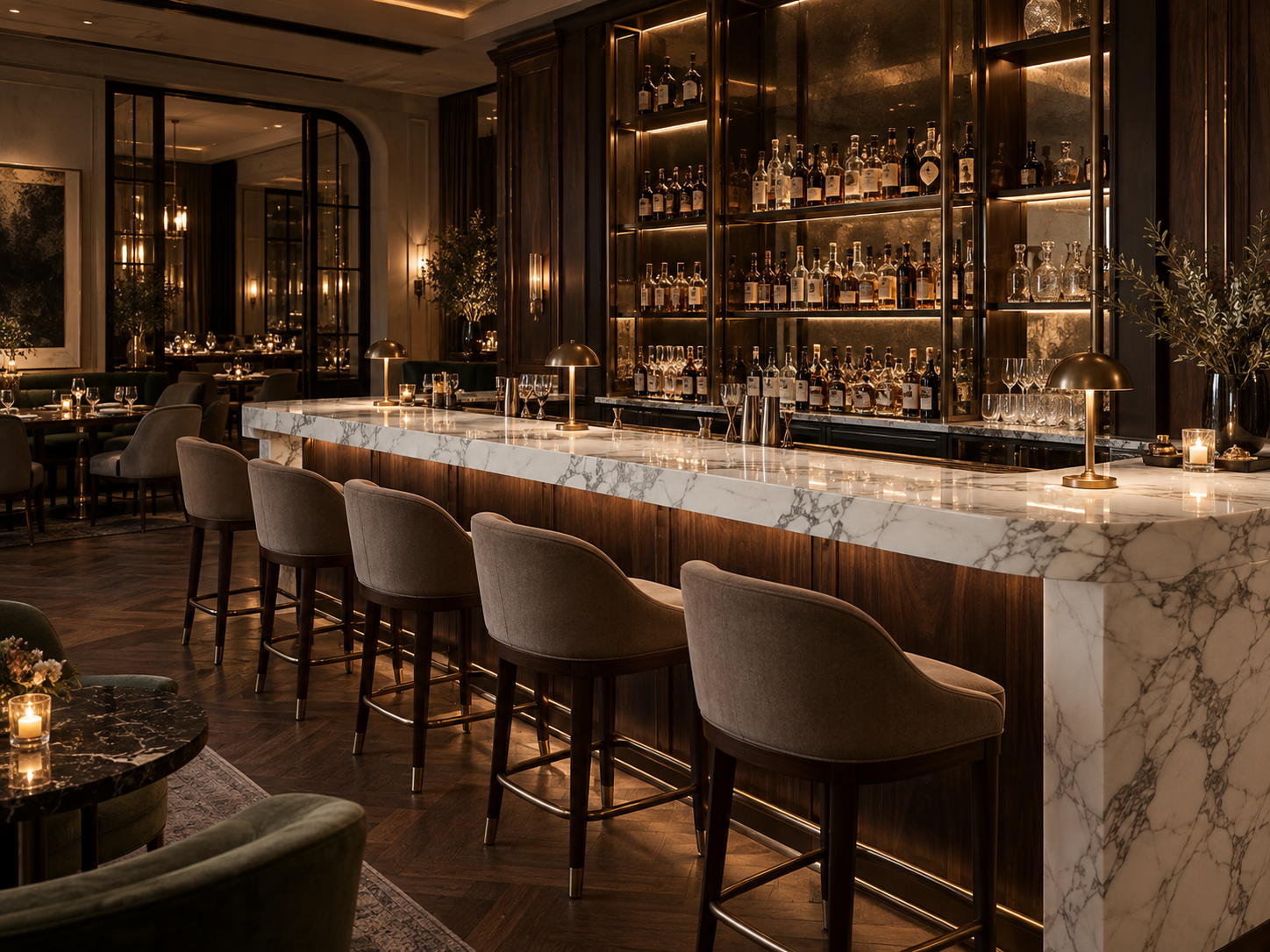
13 · Keep the bedroom restful
Dark wood and marble in bedrooms should feel composed, not theatrical.
Bedrooms usually benefit from less contrast than public spaces. If a walnut headboard wall, bedside tables and built-in joinery already give the room a dark frame, a highly dramatic marble floor may be unnecessary. Venatino can add a quiet light field; Botticino or Marmi Crema can continue warmth; a quiet Vietnam White can brighten the room.
Use the strongest stone selectively—perhaps at a vanity, fireplace or one feature surface—and keep broad sleeping-area finishes calm. Soft textiles and dimmable, warm-neutral lighting can maintain comfort without turning the whole palette brown.
14 · Separate the materials clearly
Bathrooms can carry stronger marble-and-walnut contrast.
A bathroom is compact, but its materials are often separated into clear planes: vanity, wall, shower and floor. That makes stronger contrast easier to control. A dark walnut vanity against a Statuario wall reads crisp and luxurious; Botticino with walnut and bronze creates a warmer spa atmosphere. Keep the floor simpler if the wall marble has bold movement.
| Desired bathroom mood | Marble + dark wood | Supporting note |
|---|---|---|
| Crisp luxury | Statuario + walnut | Let the wall be the statement |
| Calm modern | Venatino + smoked oak | Keep contrast fine and controlled |
| Bright | Vietnam White + dark oak | Add warm texture and balanced light |
| Warm spa | Botticino + walnut | Bronze and ivory soften the palette |
| Rich boutique hotel | Brescia Aurora + walnut | Use more restrained surfaces elsewhere |
Review stone, wood, metal, glass and towel colours together. The room’s artificial lighting can shift both white marble and walnut, so a sample viewed in a showroom’s warm light may not look the same at home.
15 · Keep accents disciplined
Choose one metal family to support the marble and wood.
Dark wood and marble already form a substantial pairing. Metal should usually refine it, not compete with it. Bronze is a natural companion to Botticino, Brescia Aurora and walnut. Black works neatly with Statuario, Venatino and Vietnam White. Brass can reinforce a warmer or more classical scheme; nickel suits a cleaner, cooler interior.
Black + brass + bronze + chrome all together rarely improve the palette.
16 · Soften hard finishes
Use fabric to bring softness back into a dark-wood palette.
Textiles introduce a matte, tactile layer between polished stone and finished timber. Ivory, oatmeal, cream, light taupe and soft grey are useful starting points. They reflect light and give the eye a softer place to rest.
With very dark wood, avoid making every major fabric dark as well unless a deliberately moody interior is the goal. A pale sofa or rug can lift the composition; in a lighter marble scheme, a small amount of charcoal or deep brown fabric can add definition.
17 · Reduce visual mass
Use glass when both marble and wood feel substantial.
Clear glass introduces a useful pause without adding another opaque colour or heavy pattern. It can work in staircase railings, partitions, table bases, shower enclosures and cabinet doors. The transparency preserves sightlines and lets daylight pass through a room where stone and timber already have strong physical presence.
Glass is not a substitute for a coherent palette. Choose the frame or hardware carefully: black gives definition, bronze adds warmth, and minimal hardware keeps the emphasis on the stone and wood.
18 · Test the palette in real light
Lighting changes how marble and dark timber relate.
Dark timber absorbs more light visually than pale finishes, while polished marble can reflect windows and luminaires. Warm light can make Botticino and walnut feel rich, but too much yellow can merge the palette into a golden-brown cast. With white marble, warm-neutral lighting softens the contrast; cool light makes the stone feel sharper and can strip warmth from the wood.
| Combination | Lighting direction | Watch for |
|---|---|---|
| Botticino + walnut | Warm-neutral | Excess yellow in walls and stone |
| Statuario + walnut | Neutral to warm | Cold white that makes the contrast harsh |
| Venatino + smoked oak | Neutral | Grey cast overwhelming the wood warmth |
| Vietnam White + dark timber | Neutral or softly warm | Sterile, high-contrast appearance |
| Brescia Aurora + walnut | Balanced warm-neutral | Too much amber light on rich materials |
Review the same slab by a window and under the intended evening fixtures. Reflections, shadows and colour temperature change the reading of both surfaces.
19 · Protect the sense of space
Small rooms need more careful contrast control.
In a large, double-height living room, walnut can cover a substantial wall without enclosing the space. The same finish in a compact room can visually compress it. Use dark wood selectively, allow light marble and brighter walls to occupy more area, and limit heavy metal accents. Let daylight and clear sightlines remain visible.
20 · Let scale carry richness
Large rooms can handle more material weight.
A generous room has more daylight, distance, wall area and visual breathing room. It can support darker walnut, Brescia Aurora, bronze and textured fabric in the same composition, provided each has a clear role. A broad view allows dramatic patterns to read as an intentional design rather than as competing fragments.
Scale is not permission to use every expressive finish everywhere. Establish a hierarchy, then carry the strongest materials across the space in measured doses. Review the transitions at doorways and between adjoining rooms, where changes in light may make the palette feel different.
21 · Choose the dominant plane
Dark wood floors and dark wood walls behave differently.
Dark wood walls paired with a marble floor generally create a clear separation: the timber defines the vertical backdrop and the stone lifts the horizontal plane. Reverse the arrangement—dark wood underfoot and marble on the walls—and the floor already carries a large dark field. A warm, dark marble wall may then remove too much contrast.
When the wood is the floor, a lighter marble wall often works better, especially in smaller rooms. When marble is the floor, walnut can be used vertically as panelling, doors or joinery, with the amount of timber adjusted to the room’s daylight and width.
22 · A useful composition check
Use 60 / 30 / 10 as a visual framework, not a rule.
One way to check balance is to imagine roughly 60% light or neutral surfaces, 30% dark wood and 10% marble or metal statement. In a marble-dominant interior, the proportions may shift toward stone, with the wood and fabrics supporting it. These are not specifications; they simply encourage you to think about how much of each finish is visible.
Count visual area, not just material types. One full wall of walnut can weigh more than several small brass details; a continuous marble floor can dominate the room even if it is only one material.
23 · Context changes colour
Dark wood can make white marble look whiter.
This is a contrast effect: a pale slab viewed beside dark walnut often appears brighter than the same slab beside a white wall, pale oak or cream surface. The surrounding value changes how the eye reads the marble. That can be useful if the room needs a bright counterpoint, but it can also make a cool white feel more stark than expected.
Do not approve the stone from a small isolated sample alone. Place it against the intended timber, then review it from close range and across the room. Compare under both daylight and the planned artificial lighting.
24 · Warmth gains depth
Dark wood can make beige marble look richer.
Walnut can deepen the perception of beige, cream and brown movement in warm marble. Against dark timber, Botticino may feel more layered and luxurious than it does on a sample board. The same effect can amplify golden or brown notes under warm lighting, so check the combination in more than one light condition.
Give the eye a lighter reference nearby—such as ivory fabric, pale plaster or a warm-white wall—to keep the beige stone from merging visually with the timber.
25 · Set the hierarchy
Decide what should be the hero before choosing the slab.
A room feels composed when one material leads and the others support it. If the marble is the hero, choose expressive Statuario, quieter wood grain, simple fabric and fewer competing patterns. If the wood is the hero, let dramatic walnut lead and select calmer Botticino or Venatino. For a balanced room, pair moderate vein movement with moderate grain.
OR
DARK WOOD LEADS → marble supports it
OR
BALANCED → moderate movement + moderate grain
Do not accidentally create two or three focal points. Pick the main view—often the entrance sightline or living-room axis—and judge the hierarchy there first.
26 · Edit before adding
Common mistakes when pairing marble with dark wood.
- Dark wood + dark marble + low lighting: the room can feel visually heavy without enough light surfaces.
- Strong grain + strong veins everywhere: two natural patterns compete in the same sightline.
- Warm marble + yellow lighting + brass throughout: the palette can become overly golden.
- White marble + cool light + grey fabric: the room may feel colder than intended.
- Dark wood on every wall: too little visual breathing space remains.
- Selecting the marble and veneer separately: undertones may clash once brought together.
- Judging only from tiny samples: repetition across a floor or wall changes the perceived movement.
- Relying only on renders: screen colour and simulated grain can differ from the real material.
The remedy is usually not another finish. First remove one competing pattern or repeated colour note, then reassess the stone and timber together.
27 · Find the right starting point
Best marble-and-dark-wood combinations by interior mood.
| Desired mood | Combination to compare | Why it works |
|---|---|---|
| Contemporary luxury | Statuario + walnut | Architectural contrast and visible movement |
| Understated contemporary | Venatino + smoked oak | Refined lightness with quieter veins |
| Bright modern | Vietnam White + dark wood | Maximum lift against deep timber |
| Warm luxury | Botticino + walnut | Related warm tones with gentle separation |
| Rich hospitality | Brescia Aurora + walnut | Layered pattern and substantial character |
| Quiet bedroom | Marmi Crema + walnut | Soft continuity and less visual activity |
Use the matrix to narrow the choices, not to replace slab review. Individual slabs vary, and the exact timber colour, room orientation and visible surface area can change the result.
28 · Compare actual materials
Bring the wood sample to the marble slab.
Bring the actual veneer or timber sample, wall colour, fabric and metal finish. Place the wood against several full slabs and against different areas of each slab; natural movement is rarely uniform. Look in neutral light, then step back far enough to judge the palette as a room rather than a handful of samples.
Digital wood colours and real veneer can differ significantly. Do not rely only on a render or a small swatch, especially when the materials will cover a full floor, island or feature wall.
Check undertones, vein detail, grain, finish and how the edges meet.
Judge overall brightness, contrast, visual weight and material hierarchy.
29 · Make the selection in context
The Fratelli Singh selection approach.
For a dark-wood interior, marble should be chosen as part of the complete material palette. Bring the veneer or timber sample, a wood photograph or cabinetry reference, wall colour, fabric, metal finish and room plan or render. Then review full slabs in a way that answers practical design questions:
- Does the room need more brightness, or should it feel warm and enveloping?
- Is the timber already the dominant material in the main sightline?
- Should the marble contrast with the wood, or continue its warmth?
- How much of each material will actually be visible once installed?
- Will the selected slab’s movement work across the planned cuts and joins?
- How does the combination look in daylight and under the project lighting?
Compare the timber with several areas of the slab and assess the pair at both close and room distances. Full-slab viewing helps reveal natural variation that a small sample can hide. The goal is not simply to find a marble that “matches walnut”; it is to choose the right warmth, brightness and contrast for the space.
Clear answers
Frequently asked questions.
Which marble looks best with dark walnut?
Both light and warm stones can work well. Statuario and Venatino create stronger contrast, while Botticino creates a warmer and more tonal combination.
Does Botticino work with dark wood?
Yes. Botticino and walnut are compatible warm materials. Lighter walls, fabrics, glass or pale plaster can keep the room from feeling too heavy.
Does Statuario work with walnut?
Yes. Statuario / Satvario creates a strong white-grey contrast against warm dark walnut and can work particularly well for feature walls, tables, islands and bathrooms.
Which white marble works best with dark wood?
Statuario creates the strongest statement, Venatino offers a quieter fine-veined contrast, and Vietnam White provides greater overall brightness.
Which marble works with smoked oak?
Venatino and Statuario can work especially well with greyer smoked-oak finishes, although the actual timber and slab undertones should be compared together.
Is dark wood and beige marble too dark?
Not necessarily. It can feel warm and luxurious, but light walls, fabrics and daylight should remain in the palette to prevent visual heaviness.
Which marble is best with walnut kitchen cabinets?
Statuario, Venatino and Botticino can all work, depending on whether the kitchen should feel contrasting, refined or warm.
Does Brescia Aurora work with walnut?
Yes. Both materials can carry substantial visual character, so lighter walls and fabrics, good daylight and restrained metal details help balance the combination.
Which metal works with walnut and marble?
Bronze is particularly versatile with warm stone and walnut. Brass creates a warmer decorative effect, while black metal works well with lighter white marbles.
Can dark wood be used in a small marble room?
Yes, but use the dark wood selectively and allow lighter marble and brighter walls to occupy more of the visual area.
Should I select marble or wood first?
Either can lead the design, but compare the actual marble and wood samples together before final approval because their undertones and visual intensity interact.
Should dark wood interiors use dramatic marble?
They can, but if both the wood grain and marble veining are strong, keep the remaining materials restrained so the patterns do not compete.
Planning a dark-wood interior?
Bring the actual wood or veneer sample, wall colour, fabric palette and intended application. Compare them with full marble slabs to find the right balance of warmth, brightness and contrast.
Request assistance ↗