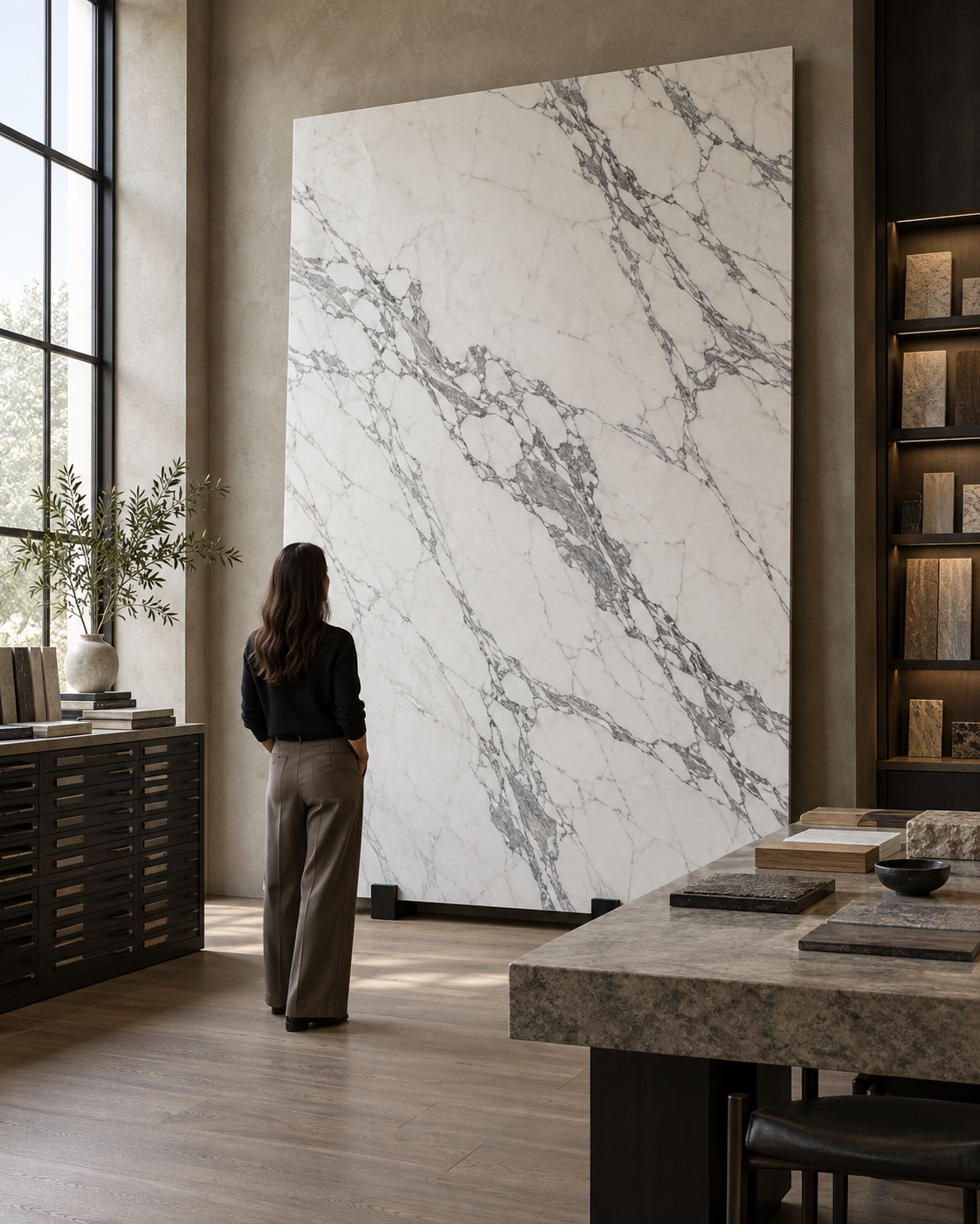
Quick answer: a marble slab often looks more premium when its full composition feels intentional, its background and vein character suit the application, and its usable dimensions allow the design to preserve that movement. Finish, slab compatibility, cutting, joints, lighting and surrounding materials all influence the installed result. A high price by itself guarantees none of these.
Place two slabs beside each other. Both may be natural stone, polished, and even sold under the same commercial marble name—yet one can feel more refined. The difference is rarely just “whiter,” “more veined” or “more expensive.” It is the way background, movement, proportion, surface, dimensions and project use work together.
There are really two connected questions: What makes the slab itself look premium? And what will make that slab look premium after it has been cut and installed? A good selection answers both before fabrication begins.
The details behind a premium-looking slab.
| Detail | Why it matters |
|---|---|
| Balanced composition | The complete slab feels considered, not dominated by one awkward area. |
| Background and vein quality | Tone, natural movement and open space create depth and character. |
| Scale and usable dimensions | Longer veins and larger fields can suit architectural pieces with fewer interruptions. |
| Finish and condition | Polish, flatness, thickness and edges affect appearance and fabrication. |
| Selection and execution | Compatible slabs, planned cuts, joints, lighting and the interior palette determine how the stone reads in place. |
01 — Start with the full composition.
Stand several metres away and first look at the slab as one image. Notice how the veins are distributed, where the background opens up, where the visual weight sits, and whether the movement has a direction. Only after that overall read should you move closer to inspect small details.
A slab may contain a spectacular vein but feel unbalanced if nearly all the movement crowds into one corner. Another slab may have less dramatic detail yet look more complete because the visual weight is distributed across its face. The intended cut matters too: a composition that feels unbalanced as a whole may become compelling inside a dining-table template—or the reverse.
At close range, a small sample helps with colour and finish. At room distance, proportion and movement take over. Both views matter, but the whole-slab view is the one a small hand sample cannot provide.
02 — Premium does not mean maximum veining.
More veins do not automatically make marble look more expensive. A quiet slab can feel calm and expansive; a balanced slab can pair a clear movement with open background; a dramatic slab can become a memorable focal point. Each can look refined when its intensity suits the space.
Often suits: broad floors and calm interiors.
Often suits: floors, stairs, walls and furniture.
Often suits: feature walls, tables and statement surfaces.
There is no universal winner. The right question is whether the marble’s intensity fits the room’s scale, view and other materials.
03 — Open background is valuable negative space.
The quieter parts of a slab are not wasted space. In a strongly veined marble, open background creates contrast and lets the major movement become legible. If every centimetre is equally busy, the eye has nowhere to rest and the strongest vein may lose its impact.
Think of it as a relationship: movement needs breathing space; breathing space makes movement more noticeable. This is especially useful when selecting a statement slab for a wall, island or table, where one or two strong veins should have room to read as a composition rather than visual noise.
04 — Look at vein quality, not just quantity.
Natural movement can gain depth from changes in vein thickness, transitions between tones, secondary veins, shifts in intensity and areas where a vein fades and returns. The pattern is geological, not a printed repeat, so small irregularities are part of its character.
Judge whether the vein has a pleasing relationship with the background and whether its direction, contrast and scale work for the planned pieces. A busy slab is not automatically poor, and a sparse slab is not automatically superior. What matters is whether the actual movement feels coherent and appropriate when viewed both close up and from a distance.
05 — Directional movement can support the architecture.
Some slabs have a clear directional flow. That can reinforce a long staircase tread, dining table, reception counter or wall panel. Multidirectional movement can feel more organic and may suit a different design. Neither is inherently better.
For a directional slab, preview the likely orientation before choosing: follow the movement along the length of a counter, across a feature wall or through a sequence of stair treads. If the design calls for continuity across pieces, confirm that the adjacent slabs can support the intended layout rather than assuming the vein will line up.
06 — Choose background tone for the finished interior.
For white marble, buyers often chase the whitest slab; for beige marble, the lightest. But the best background is the one that works with the completed room, not simply the brightest one available. A warmer beige can sit naturally beside walnut, cream upholstery, bronze and warm lighting. A cooler white may feel at home in a restrained, minimal palette.
Compare a full slab or sizeable sample beside the actual wood, paint, metal and fabric samples. View them under representative daylight and evening lighting. A stone that looked ideal alone may read too cool, too yellow or too high-contrast once the other finishes are in place.
07 — Consistency and uniformity are different.
Uniform means every piece looks the same. Consistent means the pieces feel related. Natural marble does not need to be perfectly uniform. For a larger project, a compatible group can show natural differences while sharing a similar background tone, related vein language and comparable visual intensity.
That controlled variation often looks more authentic than trying to make natural stone behave like a repeated manufactured pattern. The practical step is to review the slabs together as a lot, not approve one piece and assume the rest will match it.
08 — Large usable dimensions create design freedom.
A beautiful marble can become more useful to a project when it provides large clear areas. This may allow longer stair treads, larger wall panels, broader flooring pieces, a one-piece table or island, and fewer unnecessary joints. Larger dimensions preserve more of the natural movement at once, but “largest” is not a synonym for “best.” The slab still has to suit the drawings, access and installation plan.
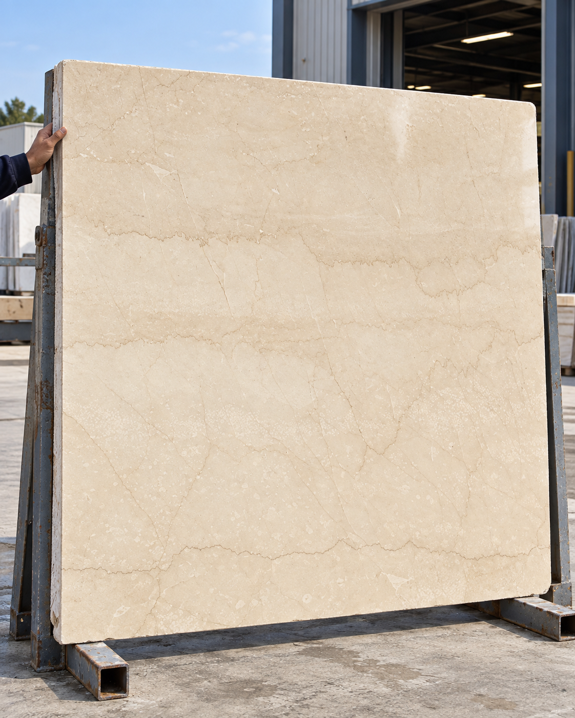
09 — Evaluate usable slab, not only gross slab.
Imagine two options. Slab A is larger overall, but important portions do not work for the required pieces. Slab B is slightly smaller, yet most of its composition fits the templates. Depending on the project, Slab B may deliver more usable material and a better visual result.
Map the desired pieces onto the actual slab and account for trimming, natural features, edge condition, cut direction and fabrication requirements. This is where the part of the stone that remains after cutting becomes as important as the headline width and height.
10 — Surface finish changes perception.
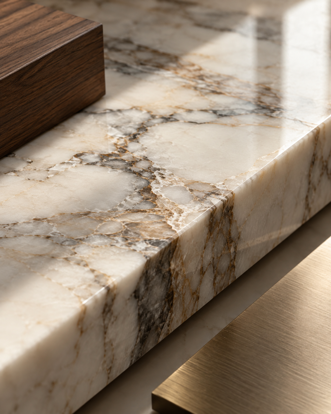
Polishing can affect colour depth, reflection, vein contrast and surface clarity. A consistent, suitable finish may reveal characteristics that look muted on a rougher surface. Still, maximum gloss is not automatically premium: a mirror-like polish may not suit every stone, room or application.
Inspect the surface across the slab under even light and then under side light. Look for whether the reflection and polish feel consistent with the intended design. Specify the finish with the fabricator and designer; do not rely on a finish name alone if the actual sample can be reviewed.
11 — Flatness matters under light and at installation.
Premium selection is not only a top-down visual exercise. Slab flatness can affect fabrication, installation and the way a polished surface reflects. Any bowing or warping can become easier to notice on large walls, broad polished floors and long counters, especially under architectural or grazing light.
Ask for an appropriate physical check as part of inspection. Flatness should be considered with the slab size, substrate, fabrication method and installation tolerances—not treated as a purely cosmetic judgement.
12 — Check thickness consistency at more than one point.
When many large flooring pieces meet, or when a staircase, counter or wall panel is being fabricated, substantial thickness variation can complicate alignment and finishing. Measure at multiple points and record the actual thickness before planning edges, levels or adjoining pieces.
Beautiful appearance and fabrication suitability are separate questions. Ask both: “Does this slab look right?” and “Can it be fabricated and installed properly for this detail?”
13 — Natural geological features do not automatically make marble cheap.
Marble is geological material. Veins, mineral changes, fissures and colour transitions may be part of a stone’s natural character. Their presence alone does not establish poor quality. Understand what the feature is, where it occurs, whether it has been treated, and whether it is suitable for the intended use.
This is not a reason to accept every characteristic without inspection. Distinguish an expected visual feature from a condition that may affect structural suitability or fabrication. If a feature is unclear, have the slab assessed by a qualified stone professional before approval.
14 — Resin is not automatically a sign of bad marble.
Some natural stones may receive resin or other processing treatments. “Resin means bad marble” is not a useful blanket rule. Instead, ask where resin is present, how extensive it is, whether it changes the appearance, and whether the treated slab is appropriate for the application.
Review the finished face and the relevant slab information together. A treatment should be understood in context—stone characteristics, processing, condition and planned use—not judged by one word on its own.
15 — Backing mesh should also be evaluated in context.
Mesh or backing reinforcement may be present on some slabs. Its presence alone does not tell you everything about the stone’s visual or practical quality. Consider the marble itself, the processing, the condition of the slab and what the application requires.
Ask the supplier or fabricator to explain the backing and any application-specific implications. Then make the decision on the complete assessment, not on an assumption that every mesh-backed slab is either acceptable or unacceptable.
16 — Inspect the edge as well as the polished face.
The face shows overall composition; the edge can reveal actual thickness, variation, finish, natural structure and aspects of processing. Look at the slab from several viewpoints, and inspect more than one slab if the project needs a lot. A polished front alone cannot answer every selection question.
17 — A premium slab can look average after poor cutting.
Consider a beautiful Statuario slab with one clear movement. If it is divided into small random pieces, the cut may sever the strongest vein, scatter the pattern and create distracting joints. The stone did not become worse; the composition was lost in the cutting plan.
Small pieces, disconnected movement and joints through focal areas.
Piece sizes and cut positions follow a considered composition.
Before the saw is set, connect the full slab to the room drawing and final templates. Decide which sections should be focal, where edges will be exposed, and which natural features or margins affect usable cuts.
18 — The same slab can produce a poor-looking or premium-looking result.
This is a visual difference, not a price comparison. With small random pieces, unplanned vein orientation and many joints, the stone’s natural movement can feel fragmented. With larger considered pieces, deliberate joint locations and intentional vein placement, the very same slab can become a coherent architectural surface.
= A COHERENT PREMIUM RESULT
If one major stage is overlooked, expensive material alone cannot compensate. Selection, drawing, cutting, fabrication and installation should be planned as one sequence.
19 — Application changes what “premium” means.
The same slab should not be evaluated identically for every use. The design determines which features matter most, and a selection that is outstanding for a wall may be difficult to use for stairs or a table.
| Application | Priority during selection | Planning question |
|---|---|---|
| Large floor | Compatible lot, useful dimensions, balanced movement | Will the group feel related across the full area? |
| Feature wall | Full-slab composition and joint position | Where should the focal movement land? |
| Staircase | Usable length, directional movement, edge condition | Can tread and riser cuts be planned together? |
| Dining table | Composition inside the final template | Does the table shape frame the best part of the slab? |
| Kitchen island | Veins, cut-outs, edges and joints | How do sink or cooktop openings affect the movement? |
| Bathroom wall | Panel composition, scale and lighting | Will panels align with corners and fittings? |
| Foyer | Viewing distance and architectural scale | How does the stone read on arrival and from the threshold? |
20 — Large slabs can feel premium because they preserve scale.
The appeal of a large piece is not simply that it may cost more. It can preserve a longer vein, natural transitions and a larger field of colour, letting the viewer see more of the stone’s geology at once. Scale is one of the qualities that small-format repeated surfaces can struggle to convey.
Still, large-format stone is only a benefit when the slab, room, access route, handling and installation method support it. Choose the piece size for the architecture and the material—not as a status signal in isolation.
21 — Joint placement can make or break the composition.
A poorly located joint can interrupt the strongest vein or land awkwardly in a focal area. A considered joint can align with the architecture, fall in a quieter portion of the movement or become less visually prominent. On large walls and floors, joints should be part of the design—not a last-minute decision made after the stone has been cut.
Review joint locations on the elevation or floor plan alongside the actual slab images and final piece dimensions. Also agree joint width and finish with the designer, fabricator and installer before work begins.
22 — Lighting can make the same marble look more or less premium.
Broad daylight can make colour appear balanced and reveal the whole field. Warm light can strengthen beige and cream notes. Grazing spotlights make polish and surface details more noticeable. Lighting may flatter or fight the stone, so judge a sample or slab in conditions close to the finished room when possible.
Coordinate stone selection with the lighting plan, especially for polished walls, feature panels and long surfaces. Avoid relying on one showroom light or a phone photograph to predict every installed view.
23 — Surrounding materials matter enormously.
Place a marble beside chrome, cool grey paint and glossy white cabinetry and it will create one mood. Put the same stone beside walnut, linen, bronze and warm plaster and it will create another. Perceived luxury is partly created by how materials relate to each other.
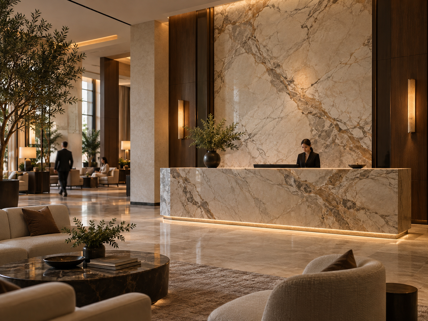
Bring real samples together where practical. Wood undertones, metal reflectivity, fabric texture and wall colour can change whether the marble reads warm, cool, calm or dramatic.
24 — Restraint makes premium stone more visible.
A highly expressive marble can lose its impact if patterned veneer, shiny brass, ornate lighting, a busy rug and decorative walls all compete for attention. A stronger approach is to give each material a role: marble as the hero, wood for warmth, fabric for softness and metal as an accent.
This does not mean every room needs to be minimal. It means that the composition should make the intended focal point clear, so the stone’s natural character has enough visual space to be appreciated.
25 — Expensive marble is not the same as expensive-looking marble.
Market price can reflect availability, variety, demand, selection, dimensions and import or supply conditions. None of those alone guarantees that a slab suits a particular room. A comparatively simpler marble can look exceptional when its selection is strong, the layout is controlled, fabrication is precise and the surrounding architecture supports it.
Does not guarantee good design, useful yield, a coherent layout or a refined installed result.
Material + planning + selection + precise work can create a premium interior.
Use the budget to compare suitable slabs for the project, but do not let the price tag substitute for inspecting composition, usable area and the planned finished view.
26 — What makes Botticino look premium?
For Botticino, premium selection is usually not about chasing the maximum number of veins. Look for a pleasing beige background, balanced natural movement, a consistent finish and dimensions that suit the pieces required. If a large quantity is needed, compatibility across the selected group becomes especially important because the stone may cover broad architectural areas.
Review the slabs together for related tone and movement while allowing natural variation. Then test the group against the room’s timber, wall colour, metals and lighting.
27 — What makes Statuario / Satvario look premium?
With Statuario or Satvario, the relationship between the white field and grey movement is central. Look at where the major veins sit, how the entire slab is composed and whether the intended template will preserve the movement. If several slabs are required, check compatibility before approval.
The most dramatic slab is not necessarily the most refined. A strong vein needs a useful path through the final piece and enough open field around it to remain clear.
28 — What makes Brescia Aurora look premium?
For Brescia Aurora, look for controlled warm movement, balanced tonal changes, breathing space and a compatible relationship between slabs. The material can bring considerable character, so surrounding finishes can be kept measured to let its warmth and natural variation remain legible.
View the actual slab alongside the timber, plaster, fabric and metal finishes planned for the room; a tonal match that seems obvious in isolation may shift under warm or cool light.
29 — Premium marble selection is project-specific.
There is no universal “best slab.” A stone can be exceptional for a wall but awkward for stairs; excellent across a floor but less compelling inside a dining-table template; beautiful on its own but incompatible with the other slabs needed. Evaluate marble against the project, not just against another slab.
- Where is it going? Identify the application and focal views.
- How much is required? Plan the quantity and any compatible reserve.
- What piece sizes are needed? Use drawings and final templates.
- How will it be viewed? Consider distance, direction and room scale.
- What surrounds it? Review lighting, wood, walls, metals and fabrics.
- How will it be cut? Plan piece orientation, edges and joints.
- What other slabs must relate? Check the entire lot as a group.
If those answers change, the “best” slab may change too.
30 — Use a premium marble scorecard.
Review the real slab and score each item against your drawings and intended finish. Do not score based only on whiteness or price; a check is useful only in relation to the project requirements.
- □ Overall slab composition feels balanced
- □ Background tone works with the interior palette
- □ Vein intensity and movement suit the room
- □ Natural variation is understood and acceptable
- □ Usable dimensions fit the required templates
- □ Surface finish is suitable and consistent
- □ Flatness has been reviewed for the application
- □ Thickness has been checked at multiple points
- □ Edge condition and natural features are understood
- □ Adjacent slabs form a compatible group
- □ The stone is suitable for the intended application
- □ Cutting potential and yield have been considered
- □ Joint locations and vein direction are planned
- □ Lighting has been considered in the final view
- □ The installed result has good visual potential
What actually makes marble look expensive?
If the full article comes down to six principles, they are these:
| Principle | What it means |
|---|---|
| Composition | The slab works as a whole, not only in one close-up detail. |
| Scale | The pattern and piece size fit the architecture. |
| Selection | Compatible slabs are chosen together for the quantity required. |
| Restraint | The marble has enough visual space around it. |
| Precision | Cuts, edges and joints are planned rather than improvised. |
| Context | The stone works with the lighting and surrounding materials. |
That is the difference between simply buying expensive stone and designing well with natural stone.
Start the selection conversation with the project.
A better conversation does not begin with “Show me your most expensive slab.” Start with the application, final dimensions, quantity, preferred vein character, surrounding materials, viewing distance and the area of each slab that will remain after cutting.
At Fratelli Singh, full-slab selection helps answer those questions before marble becomes flooring, stairs, walls or furniture. The finished result depends not only on which marble you buy, but on which slab, which part of that slab and what happens next.
Clear answers
Frequently asked questions.
What makes a marble slab look expensive?
A balanced full-slab composition, a background and vein character suited to the room, useful dimensions, a considered finish and precise layout and fabrication all contribute. Price alone cannot guarantee the finished appearance.
Does more veining make marble look more premium?
No. Quiet, balanced and dramatic slabs can each look refined. Choose movement according to the application, viewing distance and surrounding materials.
Which marble looks the most luxurious?
There is no universal winner. Botticino, Statuario or Satvario and Brescia Aurora have different visual characters; judge the actual slab against the project rather than relying on the name alone.
Can a lower-priced marble look premium?
Yes. A well-selected slab can look exceptional when its composition suits the space and layout, cutting and installation are handled thoughtfully.
Why should I inspect the complete slab?
A small sample cannot show the full distribution of veins, usable dimensions, edge condition or how multiple slabs will read together.
Do larger marble slabs always look more expensive?
No. Larger pieces can preserve longer veins and reduce visual interruptions, but the scale must suit the room, usable area, access and installation method.
Do bookmatched slabs look more luxurious?
Bookmatching can create a striking focal composition, but it requires compatible consecutive slabs and careful positioning. It is a design option, not a quality guarantee.
How do lighting and wood affect marble?
Lighting changes perceived tone, contrast and reflection. Wood, metals, textiles and wall finishes provide context, so compare actual samples together under representative light.
Should marble slabs look identical across a large project?
Not necessarily. A compatible lot can show natural variation while retaining a related background, vein character and visual intensity.
What should I check before approving a premium slab?
Review its full composition, background, dimensions and usable area, surface and edges, natural features, lot compatibility, intended cuts, lighting and fit with the interior palette.
Choosing slabs for a project?
Share the application, drawings, quantity and surrounding materials. Reviewing full slabs in context is a practical way to judge composition and project fit before cutting begins.
Request assistance ↗